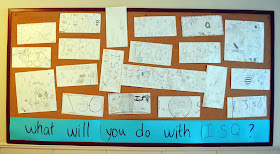
 Just over a year ago, the art department purchased a DSLR. Yet it was only last week that I discovered I could now take pictures of my whole bulletin board straight on---not at an angle from down the hall! Guess I should have tried that sooner. The hall was too narrow for my old point and click, and while there's some curvature to these pictures, I'll take it any day over the demonstration of one-point perspective in my previous bulletin board pictures.
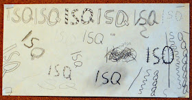
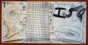
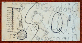
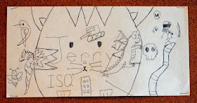
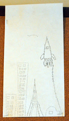 This project was based on a design challenge seen at the Briargrove Elementary Art Page. My students could only use our school initials, ISQ, to create an interesting composition. We talked about how to create variety with only three elements through repeating, enlarging, overlapping, cropping, and tilting. We also discussed thick and thin lines, along with dark and light value.
 The students did a great job with their one-class-period project. It was great to see them overcome challenges and limitations. I love projects that require them to think creatively!
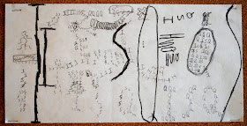
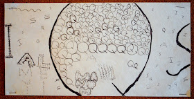
One table of students decided to join their pictures together to create a larger letter "I." I had to place it sideways on the bulletin board due to space, but it was fun to see them initiate the collaboration and work through the problems it presented. Scroll back up to see their work!

No comments:
Post a Comment