Our school recently focused on four countries as part of our Global Village Day, taking time to learn deeply about four home countries represented in our student body. The student services personnel for elementary mentioned in passing that if I wanted to do any art lessons about Denmark, that would be great. When I finally got around to researching Danish artists, I was quite disappointed. I've studied a lot of art history in college and now teach AP Art History, but none of the names on this list of artists caught my eye. Until I saw the architects.
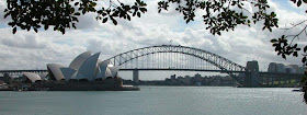
 The Sydney Opera House was designed by a Dane!
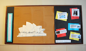
 This was just the push I needed to implement the "Architecture of the Month" bulletin board that has been floating around in my head for weeks, based on the book 13 Buildings Children Should Know. I pulled facts from the book and from the internet to create a "Did you know?" about the building. It was fun to see the Aussies at our school respond to their board, proud of their featured building. At the same time, it was great to highlight the design of Jorn Utzon, an architect from Denmark whose design beat out 232 other entries and became the iconic building of Australia.

The board is not my favorite design ever. I tried to create a design that could be updated monthly without much effort. Change out the facts, replace the building, and it's set. My TA did a fabulous job drawing the building, though it seems like it needs something more in that space. I intentionally kept that space large to focus on the building and accommodate for future buildings that might be more vertical in design, but I might tweak it in future months.

Just as I was finishing the display, two moms walked down the hallway, busy preparing Global Village Day lunch.
An Aussie and a Dane.

I wonder if it's the placement of the Opera House that's not quite right? I think I'd keep it level and move it slightly to the left. It can be so hard to get placement right when you are doing a display that will grow. Lovely idea though, and cool drawing :-)
ReplyDeleteThanks for the ideas, Linda! I think I'm content with the display for this month--too many other tasks to fuss around with this one--but I need to rework the basic idea for how to display the building in the square area. Keeping it level is a good suggestion. I might also mat the drawing or try to create more of an environment around the building...
ReplyDeleteThat sounds like the beginning of a bad joke..."An Aussie and a Dane were walking down the hall...."
ReplyDelete