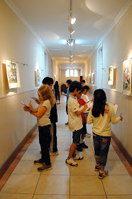
My fourth graders took a field trip.
To introduce a landscape project, we analyzed different examples of landscapes from art history. I selected eight examples of landscapes from my art prints, some western, some eastern, and some folk art. To display, I clipped the pieces along this tension line, made by IKEA for curtains. (The line was installed last fall and typically shows secondary work, the hallway is next to the secondary art room.)
We discussed vocabulary and went through the worksheet questions with an example, then quietly made our way up the stairs to our private museum. The students walked around with a clipboard, choosing to write about four of the eight pictures. After I checked their work, they were allowed to free draw until everyone was done.
Lastly, we sat around a few images and talked about techniques artists use to tell us what is close in a picture and what is far away.
The worksheet was a great tie-in to language arts. Approximately 85% of my students are non-native English speakers, so I like to emphasize all vocabulary (not just art terms) and other language arts concepts whenever possible (like the art-making/writing process).
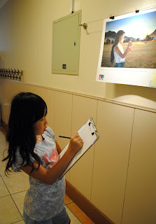
Worksheet Prompts
Foreground Nouns:
Background Nouns:
Sky Adjectives:
Landscape Verbs:
Where is this place?
I was very pleased with the lesson results. The change of location and the change of activity was enough to keep the students quietly engaged in the process. It was great to use parts of speech as a starting block for looking closely at art. At the end, as students shared their answers for nouns in the foreground and background, I challenged how they knew certain things were close. The students did a marvelous job putting words to their observations, noting things like size, overlapping, placement, and details.
Some of my students were too smart for their own good. My prints are labeled, including the museum that currently owns the piece. Noticing the place names, some of my students copied those locations instead of guessing the place the artist was representing. Henri Rousseau's jungle paintings were definitely not a painting of London...I got a chuckle out of such responses, then explained it to the students and asked them to guess another location.

