Friday, August 26, 2011

It's a Dry Erase Miracle!


I stumbled across a new art teacher supply this summer.

Back in the spring, my mom e-mailed me about a great sale on Crayola products. Not knowing what would be in stock at the local arts and crafts store, I sent her a dream list compiled from Crayola's website. I had never heard of Dry Erase Crayons but thought they would be neat to try.

I think I am in love.


I demonstrate many art skills on the whiteboard directly, but cannot model value changes due to pressure and layers. While I absolutely hate using chalkboards, I hear that's one thing they were good for...


So art teacher, meet Crayola Dry Erase Crayon. It comes in standard colors and brights (works on whiteboards or black dry erase boards). And just to show the value changes possible, I made a quick shaded sphere for you. I also demonstrated the standard green next to the bright green, then two oranges and two purples.

Thus far, a little elbow grease and a soft cloth has been all that's needed to get erase the crayon.


Mr. E recently blogged about another use of the crayons---a lesson with aluminum foil. 

But for now, I am content to be able to demonstrate creating value with pressure and/or layering on my whiteboard!

And as for you, run, don't walk, to your nearest arts and crafts store to pick up a teacher box of these crayons. If you have the time, energy, and ideas, consider picking up more for your class, but at least buy yourself a set for demonstrations...

Thursday, August 18, 2011

Q-tips, Soap Dish, and a Vegetable Strainer

Carrefour (french Wal-mart) is my favorite school shopping location. Sure, they don't have any actual art supplies. The department TA gets most of those from the art store in another part of town.*

But wandering the aisles of Carrefour (as long as it's not Sunday afternoon) is just so much fun!


Carrefour is my main source of plastic containers.

It began in my first year when I spotted these strainers. The colors caught my attention, as my tables are labeled red, yellow and blue. I picked up a few, and then continued to buy more over the years. Round, small rectangles, large rectangles (perfect for A4 paper), two-layer trays. As my teaching progressed, I found myself sorting some supplies into warm, cool, and neutral. The red containers became perfect for the warm paper scraps, blue for the cool, and yellow was the closest to neutral.


Over time, I've collected Great Lakes juice bottles, Skippy peanut butter jars, and illy coffee cans to hold other supplies. Free containers for the art department, and further justification of my daily orange juice ritual.  You can see that some of the containers are extra colorful.  The Great Lakes rectangular juice bottles are my favorite water containers.  They hold enough water for two students to use without changing water during class.  The shape is very stable and never tips.  The ridges in the corners also provide a great texture to help loosen paint from the brushes.

While I love these containers, I recently wandered Carrefour looking for something to hold crayons. These containers are too tall, making them impractical for crayons and little hands.
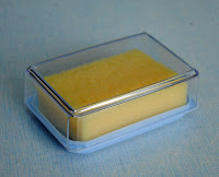

I first spotted soap dishes and noticed the similarity between the lid and a crayon box. (I also had a regular size crayon and large size crayon in my purse to confirm sizes.)

At $.50 each, I bought 10 for crayons. I also picked up some new spongebobs. After three years, they were looking a little worse for wear and I was a few short in the larger classes.


When I was unpacking the items in the classroom, I realized that the soap dish lids were the perfect size for spongebob! In the meantime, I'd also noticed that my Chinese Q-tips came in the cutest little transparent plastic container that seemed like they were meant for crayons. So bring on another trip to Carrefour and 20 more soap dishes. And, well, two different brands of Q-tips had two different size plastic containers---same height, different diameters---so I had to get 12 of each. And now I have great little cups of crayons and thousands of Q-tips in two large plastic bags.


*The art store is half the size of the average convenience store in the states, or smaller, and packed floor to ceiling with high school, college, and professional level materials. Acrylic, oil, tube watercolors---but no tempera. Absolutely no Crayola products, but they do stock Prismacolor Markers. Colored pencils, oil pastels, but no crayons. My markers and crayons are imported. And if you had any thoughts about crafty stuff, like pipe cleaners, pop poms, and tacky glue---nope. Just the basics. We have to run around town to many other stores to find all the random supplies I want.

Tuesday, August 16, 2011

Friendly Facelift


Our cafeteria got a facelift, just in time for the new year! The bottlecaps were installed the day before school started. It was a great surprise for the students at lunchtime---seeing their artwork up on the wall! The kimbap was created by elementary students. High school students worked on the taco, with a lot of work being finished this summer by the secondary art teacher.

As you can see, there's a few gaps and areas needing touch-up, but I am thrilled with the result! Now to plan the coordinating mural for the right side of the cafeteria. I'm thinking pizza and dragon fruit...


In addition to the bottlecaps, I managed to get some paint up on the walls. While our facilities manager was out of town, I convinced his assistant to paint the columns in cafeteria. I was inspired by a picture of another school cafeteria that I found while looking for design ideas for our new Early Childhood Center.

When the facilities manager returned, he asked me if I painted the columns. I said "Well, I didn't physically do the painting, but I might have suggested the colors." A few days later, I heard him tell the Early Childhood Center Project Manager "If we build it, she will paint it." I had to laugh and smile, both at the concept and at the Field of Dreams reference.

Student Services retooled their Welcome and Goodbye boards from a less-traveled hallway to now go under the bottlecap display.  Overall, the cafeteria looks so friendly and fun!  Much less institutional...and more like a space for students!

I take an added interest in the cafeteria because my classroom is directly behind the bottlecap wall. I love to wander the cafeteria at lunch, sitting with different students, chatting, and eating lunch. This year, I am free during all three lunch periods which allows for extra socializing! And after three years of teaching, the middle school is now full of my former 5th graders. Middle school lunch is such a treat, seeing all the friendly faces of my former students.

The cafeteria is also the location for the art gallery portion of the Elementary Fine Arts Gala. The colored columns will alter the all-white gallery space, but I'm sure the splash of color will work in our favor.

Saturday, August 13, 2011

Another new display


It's off to the printer!

The poster depicts class expectations based on the kid-friendly version of our Expected Schoolwide Learning Results (ESLRs). Unfortunately, I won't have my new "rules" ready for the first day of art class, at least for the classes that come on Monday, but I'm excited to see the final result. It will be about 1 meter wide and just a little taller than that. This is the first thing I will have gotten printed for my classroom! Banners, teeshirts, mugs---my designs end up all around my school and on my students, but this is new territory. At less than $10, I might be getting a lot more custom posters for my room.


By the way, purple is underrepresented in my rainbow room, thus the tone-on-tone purple poster.


The background image (ESLR MAN!) is compliment of our curriculum and professional development coordinator. In preparation for our WASC accreditation visit last spring, she analyzed how we utilize (or don't utilize) the ESLRs as a part of daily school life and learning. The ESLR icon was born as a way to visually identify the ESLRs at play in school. We joke about ESLR stamps, temporary tattoos---you name it, we've suggested it.

I took the icon and added stylized labels of our five ESLR categories, and then she and I attacked our campus with the icon last semester. We stuck ESLR MAN! next to bulletin boards, plaques, student work---anything that demonstrated achievement in one of the five categories. The goal was to help student and teachers see how they were already working towards our ESLRs. And now ESLR MAN! has found his way into the background of my classroom EXPECTATIONS...


In case you were worried, I haven't gotten rid of my "Awesome Artists" poster. I moved it to the back wall of my room, above the construction paper. I still plan on referring to it and discussing ways students can be "Awesome," but for this year, the focus is personal; In art class, I will try my best to learn and not give up.

Monday, August 8, 2011

New Year, New Displays


My room has evolved just like my teaching. The first year was all over the place, making lots of mid-year changes and figuring it out as I went along. The second year was a huge change, being able to plan well from the beginning and knowing much more what I wanted. The third year was almost a complete repeat of year two, with only subtle tweaks (character traits in rainbow colors, redoing teacher pockets for new teachers, etc.).


One new addition for year three was the "artmaking process." When reading an info sheet about the Davis Elementary Textbook Explorations in Art, I was curious by the "five-step studio process, aligned with the five-step writing process." I asked around with the elementary teachers and it turns out, they all teach slightly different versions of the writing process.

     Is making a 2nd draft a step?
     Are revising and editing different steps?
     How about publishing?


After thinking about it for some time, I decided to simplify and create a four-step process. I didn't get the posters up until December, but they found a perfect home just above my white board (funny thing...maybe I custom fit them to the space...).


I thought long and hard about the subject matter of my example art piece. While I first thought an apple would suffice, I decided to chose something from the city culture here in China. The "May Wind" is a large sculpture in a park along the waterfront near the "city hall." It is easily recognized by the students and taps into local pride and identity.


This year, I'm itching for some new displays. My line families (straight, angled, and curvy), created on newsprint, served me well for three years, but could hold up no longer. I'm also considering revamping the art "rules" (Awesome Artists) to align to our Expected Schoolwide Learning Results (ESLRs). Finally, I would like to emphasizes vocabulary and feature artists somewhere in the room. And school starts on Wednesday. BUT elementary specials start the following Monday, so I have until the 16th to finalize my "first day" displays, with room to grow and change as the year progresses. In the meantime, I'm scouring the art blogs for inspiration.

Search This Blog

Total Pageviews


  © Blogger template Shush by Ourblogtemplates.com 2009

Back to TOP