To look at art.
To think about art.
To speak about art.
During my first methods class, I observed a recent grad teaching at an elementary school in Phoenixville, Pennsylvania. Something she said stuck with me. She told me that most adults don't spend their time making art, but they do look, think, and speak. She wanted to teach her students how to interact with art for the rest of their life, and in the manners in which they would interact---looking, thinking, speaking---not just making!
Of course there is a place for making. I spend most of my art classes making. But I've also expanded what we make beyond your traditional fine art.
Design education is a huge topic and I won't begin to scratch the surface, but one way to think about it is making images (2D), objects (3D), places (3D), and experiences (4D). My students are exposed to graphic design (images), product design (objects), and architecture (places).
To begin to understand principles of art in graphic design, 5th graders analyze magazine advertisements. They sketch layouts, identify color palettes, and answer questions about style (text and images) and principles (repetition, emphasis, balance, proportion). Student then use a favorite advertisement as a template for advertising one of our Expected Schoolwide Learning Results (ESLRs).
The students create their advertisements in PowerPoint. We change the slide size and orientation, then use AutoShapes, Clip Art, and Text Boxes to create the ad. I like that the program is quicker to pick up than Photoshop, Illustrator, or InDesign. The skills they learn will transfer well to other Microsoft programs, which is handy as they enter middle school.
I do not allow the students to get images on the internet for numerous reasons, including the questionable results sprinkled in any Google image search and the quality of most of the images. If they cannot find what they want in clip art, I search for free stock photos and drop them into their folder on the network. I also give them access to the school logo and the newly designed ESLR icon.
This ad is one of my favorites. I love the use of the ESLR icon above the words. Perfect substitute for the heart!
After the images are added, I let the students vary from the original color palette. This girl decided to make her advertisement more interesting by eliminating the all-white background and adding more layers.
We don't exactly have a baseball program at our school, but I like this advertisement about learning good sportsmanship in PE class.
Po, from our production of Snow White and the Seven Dwarfs, made this advertisement. He gave me a shout-out in his ad! He replaced Benjamin Bratt's name with his own name and "Inspired by a True Story" with "Inspired by Miss M." Unfortunately, I asked all the students to remove their names from the posters, only identifying the posters by our school, and not by the designer.

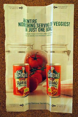
The Captain (Doc) from Snow White just loved this interactive advertisement. He suggested using the ESLR icon in place of the can of Chef Boyardee, which prompted me to make the icon available to all the students. We carefully crafted a phrase that would work on his advertisement both when folded and unfolded. I love the final result!


2 comments:
These are amazing for 5th graders - Congrats! How long did the project take you?
Thanks for the compliment, Nancie!
The project takes at least five 50 minute class periods, though I've taken six or seven depending on interruptions and side activities.
1--Discuss Graphic Design as Art and begin worksheet (reviewing some terms)
2--Introduce Rule of Thirds and finish worksheet
3--Introduce using Powerpoint as a drawing tool and try to recreate chosen advertisement with AutoShapes
4--Review ESLRs and demonstrate how to use the layout of the chosen advertisement to create a new ESLR ad along with clip art and ways to search for images, begin creating ad
5--Peer critique and finishing touches
A sixth class period in the computer lab goes a long way to refine ads. (Save the peer critique for the last class period.) Also, I've done side activities about fonts after the worksheet and before going to the lab.
This year, at the same time as this lesson in art, the fifth graders were learning about media and new literacies in ELA. Though I've taught this lesson three years running, this was our first time pairing the units; I saw great results from the collaboration!
Post a Comment